Button Design Best Practices
It can be tricky figuring out when to use certain buttons and where to put them on the page. I still get it wrong occasionally.
Here are some high-level tips to help you navigate the process.
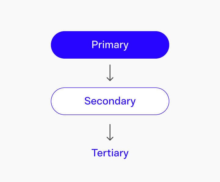
Button Hierarchy
Put your most important button first. This is our primary button (also called a CTA, or call-to-action) and you only have one of these. This is the thing we really want people to click.
Next is your secondary button which is a medium priority link. This is for things you want to highlight, that aren’t as important as the primary button's destination.
Lastly, we have tertiary buttons which are for low priority links.
The button hierarchy looks like this, from most important to least important:
As a user of the web, you probably already know this intuitively. Below is an example from One Medical. On this homepage, the designer uses three buttons to present three possible user paths. In order of importance, they are:
"Sign up today": High priority
"Gift a membership": Medium priority
"Sponsored membership": Low priority

If you only have one user path, you can have one button. Or if you want a primary and tertiary button (but not a secondary), that's fine too. The main thing to keep in mind is to be respectful of the user's time and not present them with too many options.
Button Location on the Page
Buttons can be positioned on the page in these three ways:
Left-aligned
Right-aligned
Full-span
The one you choose depends on where the user is and where they’re going. I like to think of it like a flashlight. You point the light in the direction you want the user to go.
Left-aligned
As a general rule, marketing pages and in-page forms will have left-aligned buttons. On this form below, the user’s eye is moving down the page from one field to the next. So the designer put a primary button where their attention was already headed (flashlight pointed down), along the left edge of the form fields.
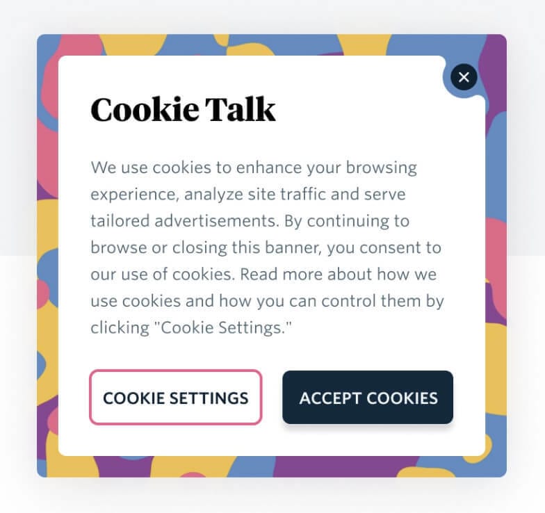
Right-aligned
If a user is going through a set of steps, like in an onboarding process, then a primary button works well on the right. In this example, their attention is moving forward through a multi-step process, from left to right. (For languages that read right-to-left, this might be reversed.)
In this example, our flashlight would be pointed toward the right.
Modals, notifications, tutorials, and progressive disclosure forms usually have right-aligned primary buttons. Clicking “Accept” on a cookie notification allows the user to continue their forward progress of using the site, so the primary button is on the right.
Full-span
Full-span buttons are nice when you want to emphasize a single action. If your layout uses cards, full-span buttons work well. In this example, the user's attention isn't flowing in one direction, rather it bounces from card to card in short bursts.
My flashlight metaphor starts to fail here. Maybe it’s flashing on each card or something.
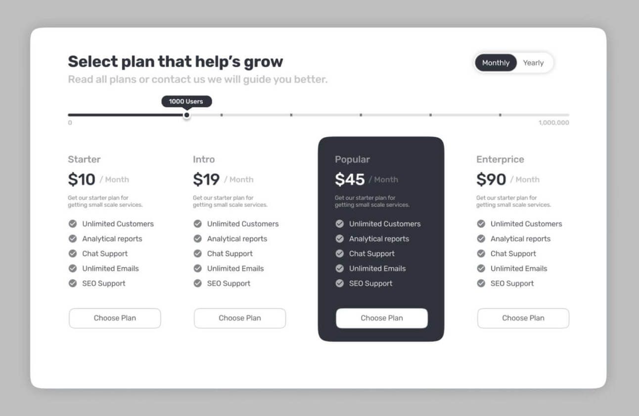
One interesting thing to note: see how these are all secondary buttons? If the designer used all primary CTAs, it would violate our hierarchy rule of only having one primary button. And it’s less visually heavy this way.
Enjoy this? Every Tuesday I send one design tip to help you become a better, smarter designer. Sign up here: