Don’t use pure black in your headlines
When you sit down to design a website, it’s tempting to pick black (#000) for your headlines and body copy and be done with it. Resist this urge! Pure black copy on a white background is too jarring. Try a dark gray instead. Most big companies do this…

The New York Times uses #121212
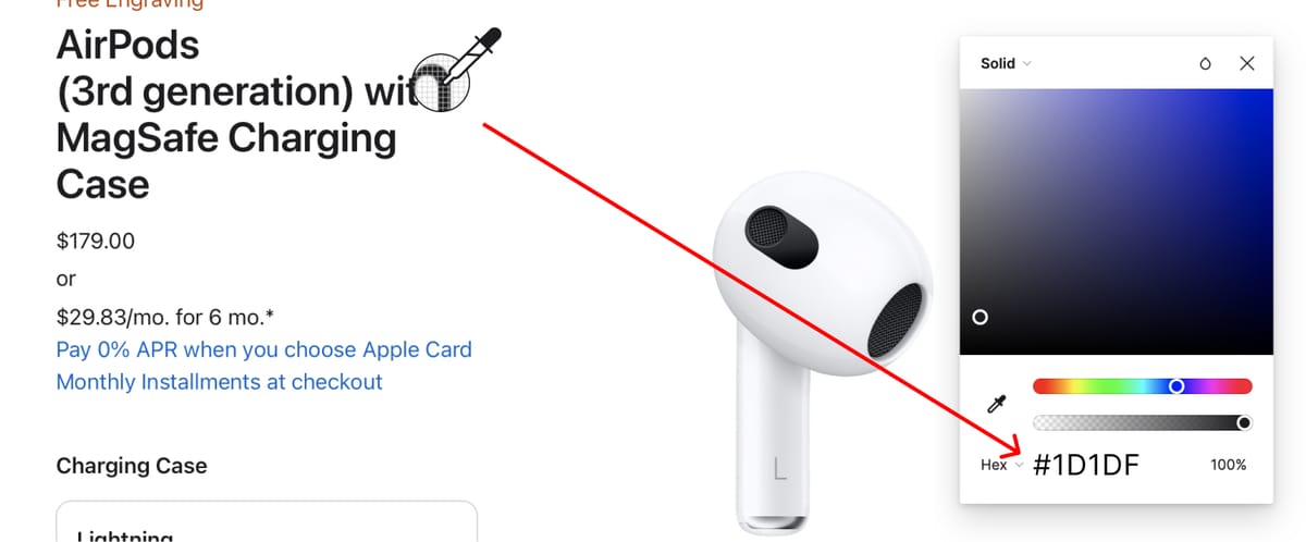
Apple uses #1D1D1F
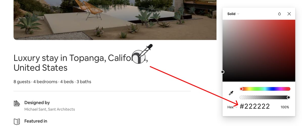
Airbnb uses #222222
Tip:
Sometimes I’ll sample a color in my color palette and slowly add black to it. Then I’ll use that new color for all my headlines and body copy. This makes the color palette and copy more visually cohesive.
Enjoy this? Every Tuesday I send one design tip to help you become a better, smarter designer. Sign up here: