How to use a concept in design
Great art often has a concept. Edward Hopper's Nighthawks effectively communicates the idea of solitude. And Warhol's Marilyn Monroe Diptych explores ideas about celebrity culture and mortality.
When the imagery of a painting aligns with its underlying concept, the whole thing just clicks.
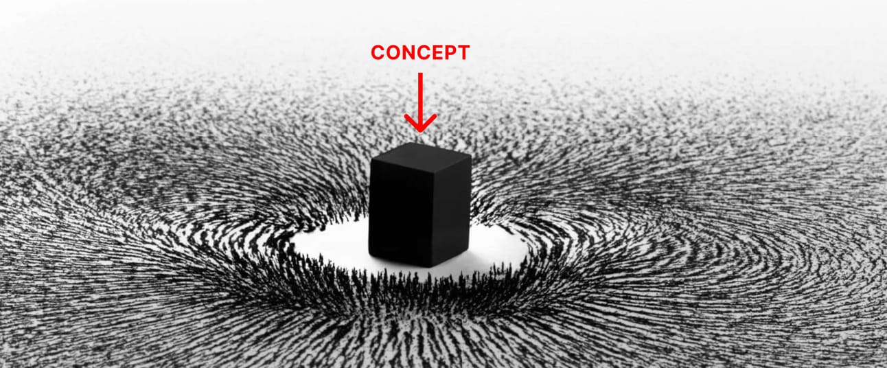
The concept magnet
When I'm creating a new site, I often try to use a concept.
A good concept is like a magnet. It commands every element on the page. Typography, color, style, and copy – they’re all attracted to the magnet and do as they're told. When all the elements work together, it creates order.
I find that when I start my design with a strong concept, all of the other pieces fall into place easier.
Website concepts are more subtle than fine art. You can't be heavy-handed with your concept because ultimately a website needs to be usable.
Below is a design my friend Ximena did for a site called Preserve. Can you guess the concept? Take note of the following:
- Textured typography
- Wooden drawer to save favorites
- Typewriter font
- Textured recipe cards
- Products photographed on textured surfaces
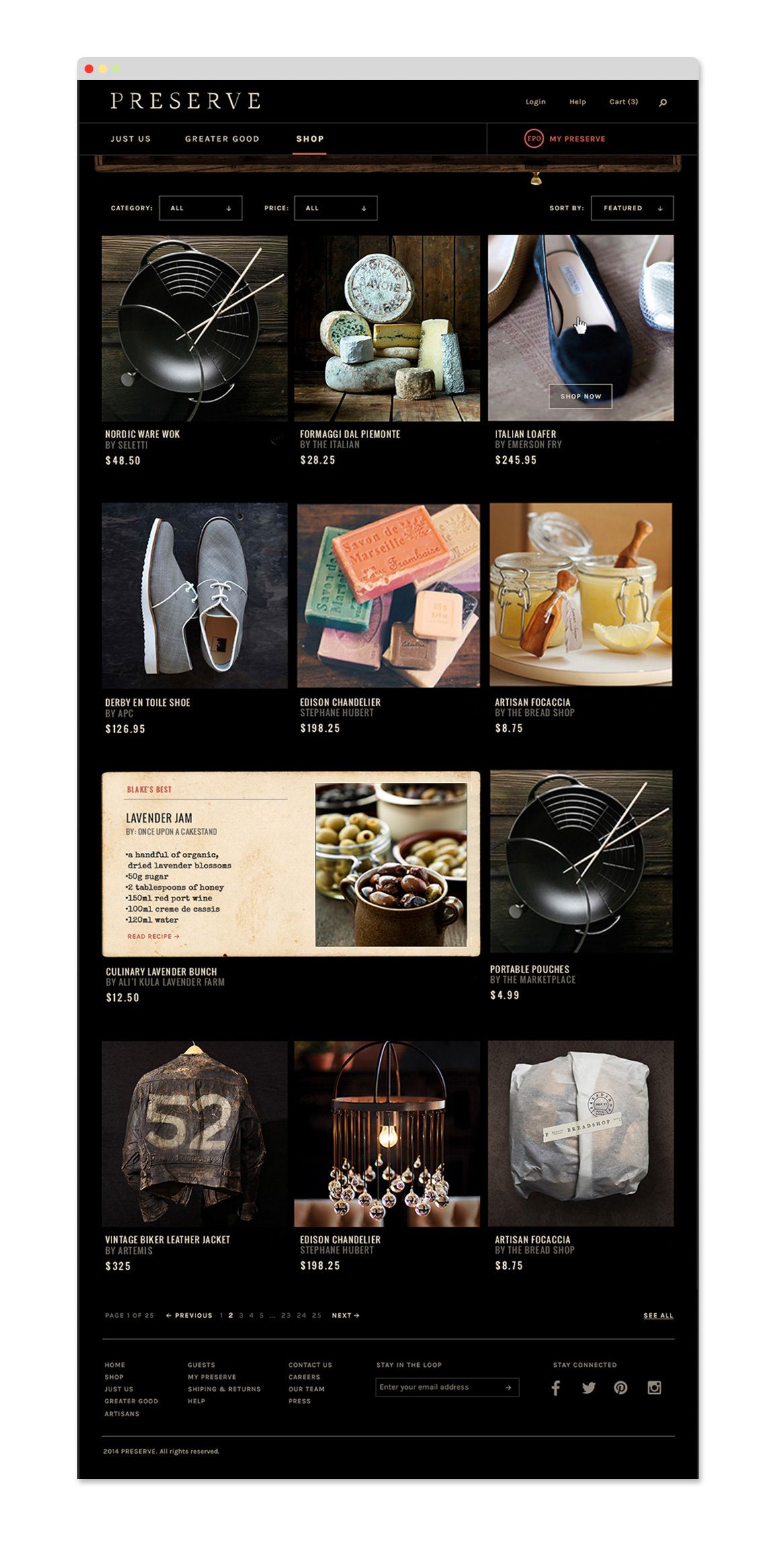
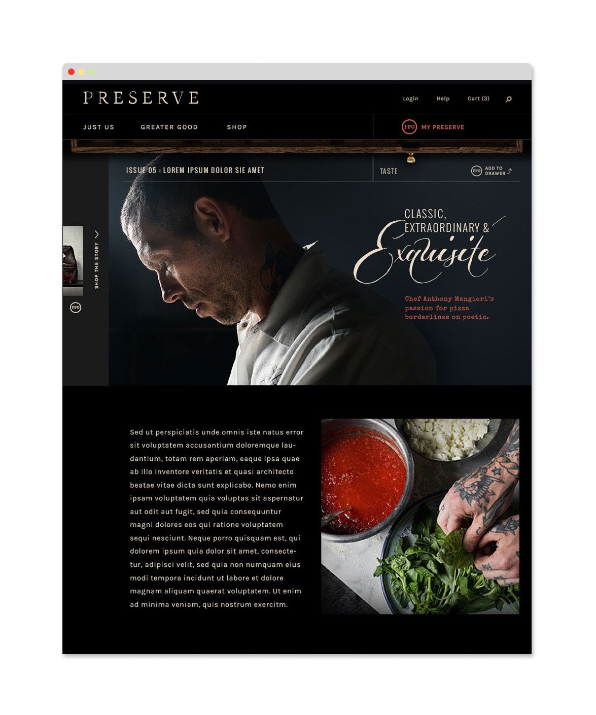
I would say the concept is "Handmade".
What determines the concept?
Here are two things that can help you narrow it down.
Audience
Who is the website’s audience? If the audience is kids, your concept might be playful. If the audience is fashion aficionados, the concept might be sophisticated. If your audience is bankers, you might want to focus on words and data. Think about who the audience is and what their goals are as a user. Does your concept work within those constraints?
Brand
Part of the concept is determined by the client’s brand (if there is one). Think about what the company stands for and try to not veer outside of that. For example, a well-worn and textured site like Preserve wouldn’t work for a company like Target because they have a clean red and white aesthetic. And none of the products they sell are handmade.
When not to use a concept
Concepts are great when you're telling a story. They can be trickier for things like SaaS apps. That’s because the software itself is a kind of story. The concept for Superhuman (the product) is 10X email productivity. The concept for Basecamp (the product) is simplified project management. For these sites, it’s sometimes better to support the product with pretty visuals that are devoid of any meaning.
Enjoy this? Every Tuesday I send one design tip to help you become a better, smarter designer. Sign up here: