The Attention Rule
At a basic level, design is about communication. You’re trying to deliver a message.
But people are busy and easily distracted. So, your design needs to account for that. If you waste someone’s time, they’ll tune you out and your design will fail.
One of the best ways to prevent getting ignored is to design within the time constraints of the medium you’re working in. Each medium (logos, packaging, web, posters, etc.) has a certain amount of time to deliver a message. A logo should communicate nearly instantly but a poster may have several seconds. An annual report may have an hour or more to communicate.
How it works
If you take each design medium and sort it by the time it has to communicate, you have what I call the Attention Rule.
If we visualize it on a scale, it looks something like this:
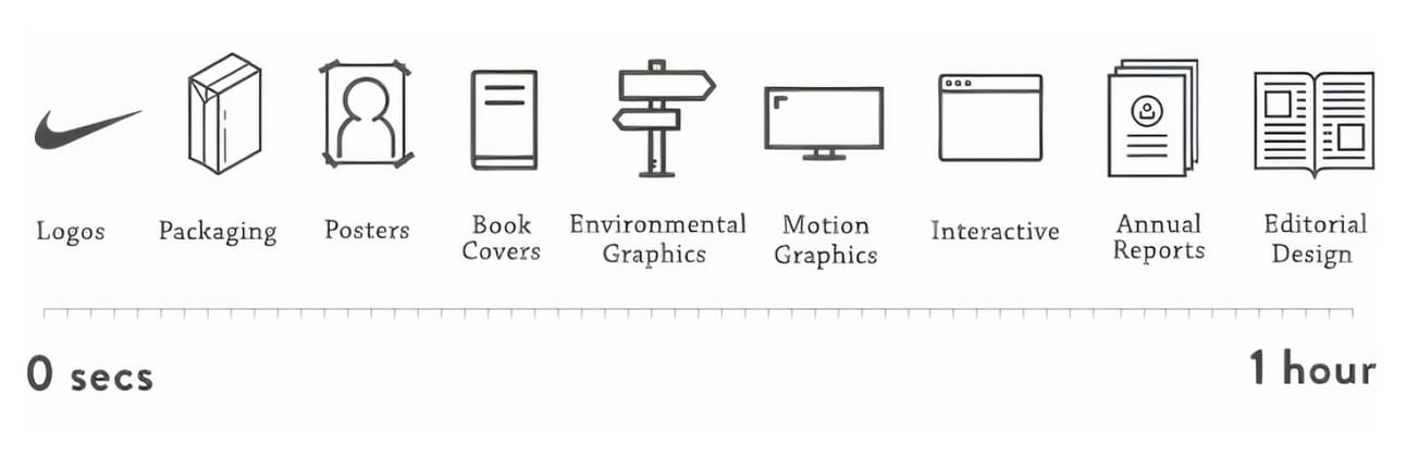
The design mediums on the left side of the scale must communicate quicker than those on the right. Take logos for example. They should communicate in less than a second. That's because in everyday life, people only get quick glimpses of logos during their day. Like the logo on the FedEx truck driving past you. Or the logo on a runner's shoe as she breezes by. These interactions are fractions of a second long, so the logo needs to do its job fast. Let's say we think Nike needs a new logo and I pitch them this:
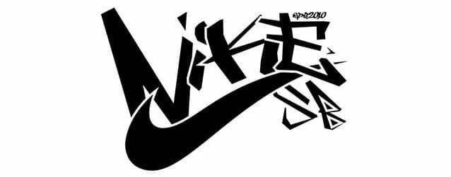
Stare at it for a moment. Notice your reaction as you take it in. Your eye bounces around the different parts haphazardly.
The logo is too busy. You can’t absorb all the details in less than a second due to the sheer volume of elements involved. Look at all the pointy corners – each one is like a little hand waving at your eyeballs, saying “look at me!!”.
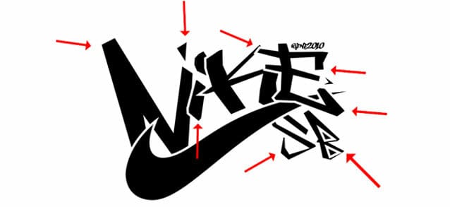
All of those pointy corners prevent your eye from moving around easily. It’s a constant start, stop. Start. Stop. This logo violates the Attention Rule.
Now, look at Nike’s current logo:
It’s effortless to look at. Unlike the previous example, the shape indicates which direction your eye should move when looking at it (left to right). Also, notice that there are only two points on the entire thing, at the beginning and at the end. Fewer pointy corners means the viewer can absorb it faster.
Long form design mediums
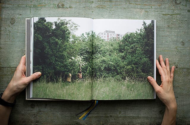
So what about the right side of the attention rule scale? On the right, we have things like books, magazines, and annual reports. These are long-form mediums that allow the designer to slowly deliver a message, page by page.
Say we're designing a cookbook. We can insert a photo of people harvesting fruit even though the image isn't crucial to making the recipe. It is there to add texture to the story in a subtle way. And it allows the reader to pause between recipes. It doesn’t violate the attention rule because books are meant to be consumed over a long period of time.
The Attention Rule and the web
It can be challenging to use the attention rule on the web because websites can be anything. I might spend 30 seconds on IMDB to figure out the name of an actor, and spend 30 minutes on Wait But Why reading about procrastination.
When designing a website or app, I like to put myself in the shoes of the audience. What are they trying to accomplish? For an app like Headspace, the user is trying to learn and relax, so the creators embedded these lovely educational videos throughout the app. The videos are more effective than text alone because they are so soothing.
Is the user only trying to quickly complete a task? Then there should be a high focus on streamlining the UX of the app. Think Uber or Postmates.
Further complicating things is a user’s personal preferences. I’ve noticed my programmer and UX friends often want their websites to get to the point. No fluff. I once made a beautiful site full of 3D animations for an audience of backend developers. They hated it! Lesson learned.
At the other end of the spectrum are artists and writers who like a bit of novelty and storytelling. For these folks, you can get more creative.
If your audience is broad, I find a good middle ground is to create user paths that allow for both types of users. Create a story but also make sure to include a skip button.
Enjoy this? Every Tuesday I send one design tip to help you become a better, smarter designer. Sign up here: