Don't mix illustrations & photos
Oddly I’ve never seen this topic written about but it will save you so much time! Don't use both illustrations AND photos in your website design. Pick one and stick with it.
Why does it matter?
It’s all about cognitive load. Using both photos and illustrations makes your user think too much. Pretend for a moment that you’re bilingual and you’re reading an article where every odd-numbered paragraph is written in English and every even-numbered paragraph is written in Spanish. Even though you speak both languages you would still need to slow down slightly to make sense of the information. Using both photographs and illustrations in your design does the same thing. It slows down the user. They may not even be conscious that it’s happening but their subconscious will feel it. Good design is about making things only as complex as needed and no more. And this rule helps with that. It’s a forcing function that helps remove future decisions about what imagery to use during the design process. Here are some websites that use only illustrations or photographs:
Illustrations only
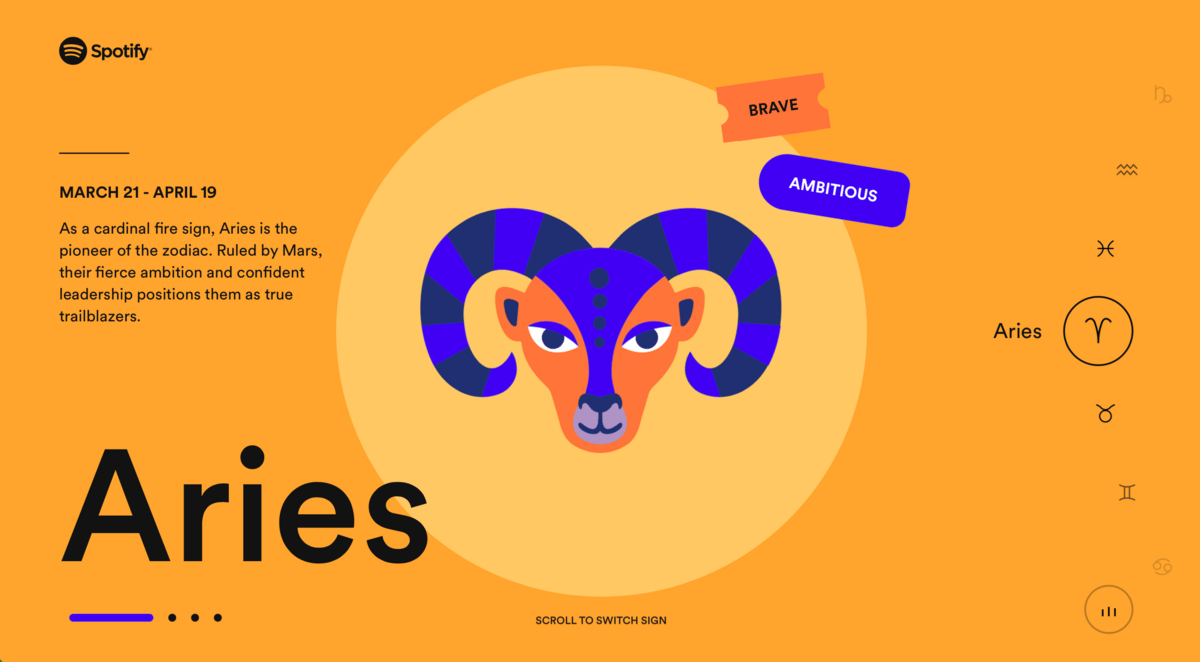
A playful microsite from Spotify.
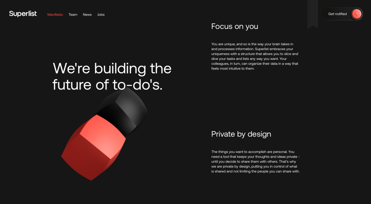
95% of this site is 3D illustrations. When they must use photography for headshots on their team page, they wear red and black shirts that match the color palette of the site. Nice!
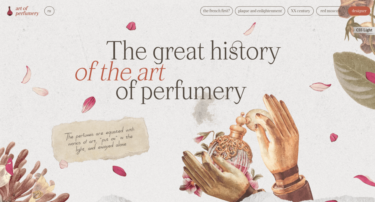
It looks like the designer of this site used public domain illustrations. The Smithsonian has a massive library of similar images that are free to use if you want to try something similar.
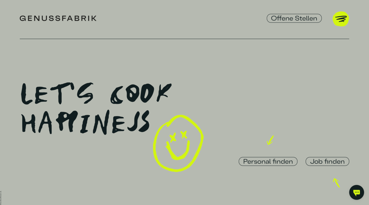
Simple doodles and grungy text are sometimes all you need.
Photos only
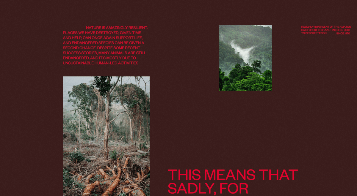
Sometimes photos can connect emotionally more than illustrations. This site raises money for endangered species so it makes sense that they only use photos.
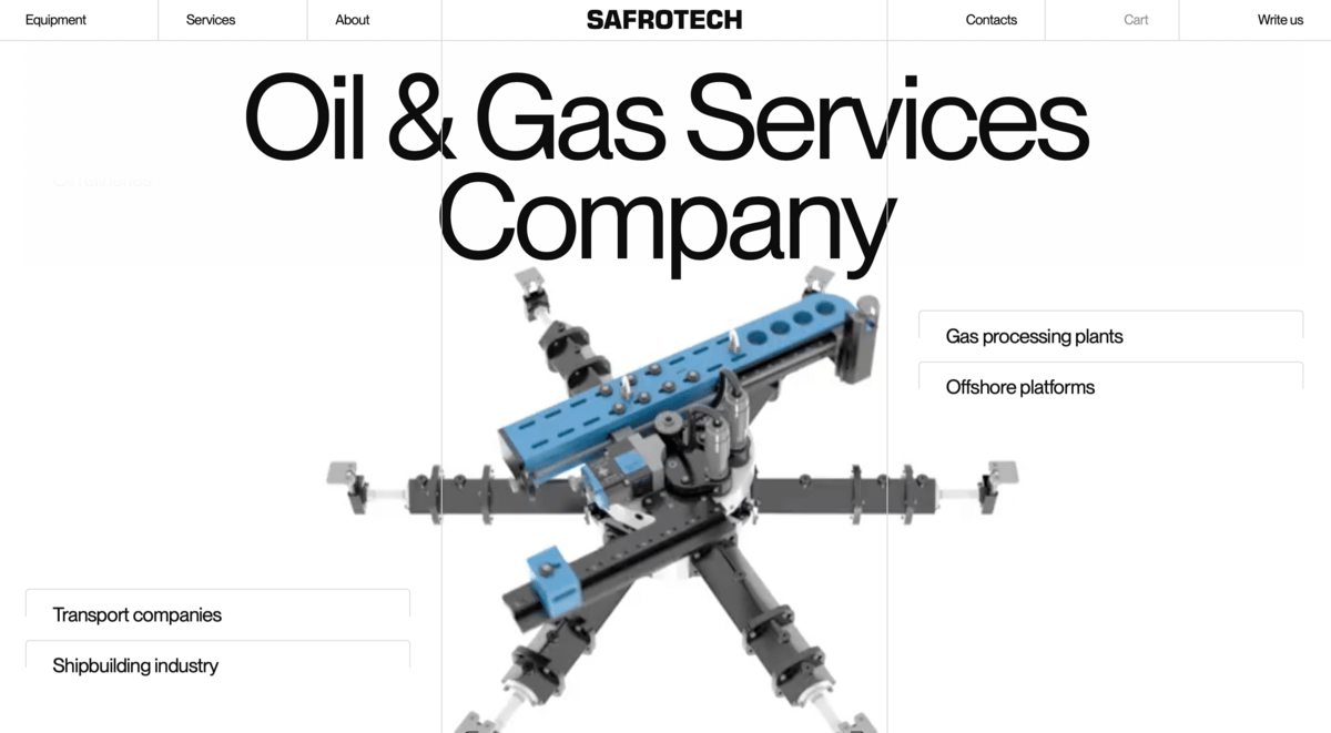
These folks manufacture industrial metalworking machines. Well-executed photographs (and near photorealistic 3D renders) convey a sense of engineering excellence.
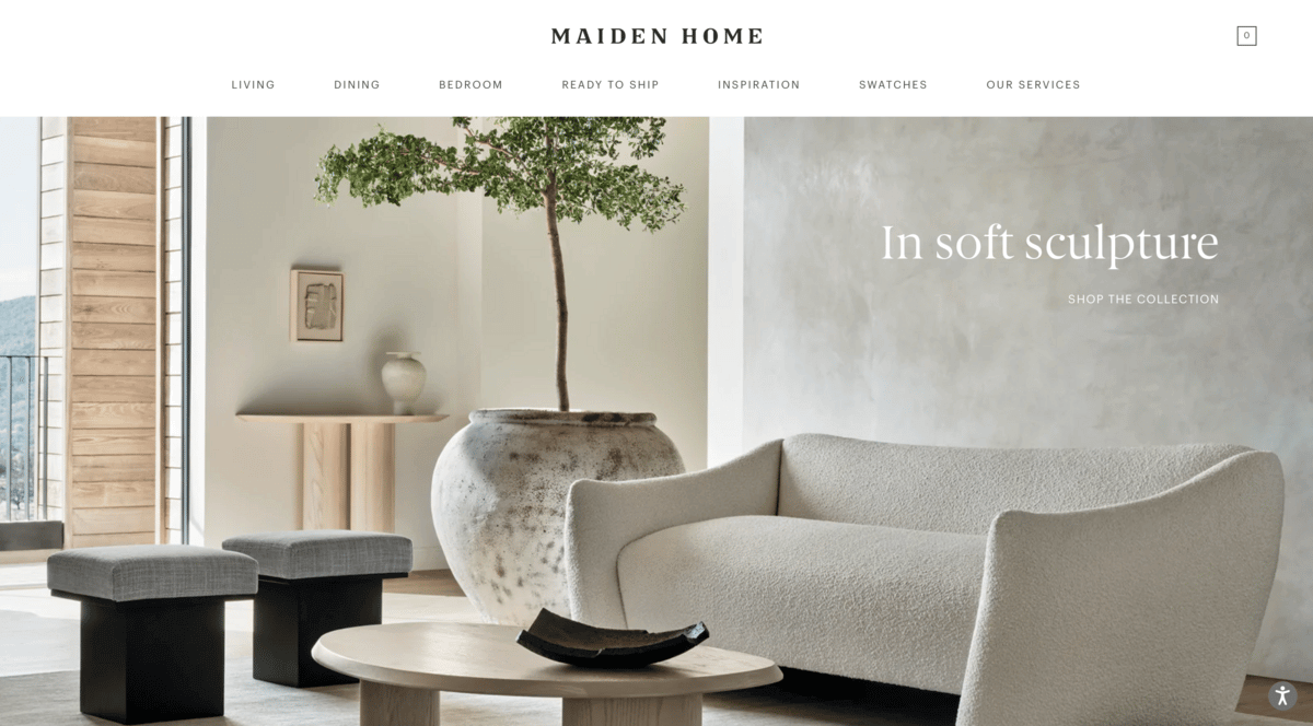
This home furnishings site spends lots of time on lighting and styling to maintain a consistent feel in all their photos.
Enjoy this? Every Tuesday I send one design tip to help you become a better, smarter designer. Sign up here: